Project Overview:
On average, a typical middle class American family wastes over 4M lbs of materials to keep up with their lifestyle. A majority of that is what they throw away or recycle on a daily basis. Waste Less is a non-profit committed to raising awareness and helping people live a more sustainable lifestyle by wasting less.
Roles:
UX Researcher
UI Designer
Visual Designer
Tools:
Figma
Zoom
Adobe Photoshop
Adobe Illustrator
Duration:
72 Hours

Challenge:
Waste Less is looking for a way to use technology to help people become more conscious about the waste they throw away.
Problem Statement:
Despite increasing awareness and efforts to reduce waste, a waste management application is needed to help individuals and communities more effectively track, manage, and reduce their waste, which has significant negative impacts on the environment and public health.
Goals:
With the challenge presented to me, I decided to try to reach 3 seperate goals while creating and designing this app. Those 3 goals included:
A tool for managing waste, the goal is to make waste management simple, convenient, and accessible for everyone.
Help users reduce waste by sorting, disposing, and tracking.
Use a combination of hardware and software to provide an intuitive and user-friendly interface for waste management.

Design Process:

User Interviews:
With such a short period of time to complete this project, I decided the best research solution would be user interviews. I conducted interviews with friends and family between the ages of 18-40 years old from various professions, via phone calls and zoom video calls. Some of the questions asked during the user interviews:


Interview Results:
User Persona:
After conducting user interviews, I used my found information to create a user persona. I created it to better understand the needs, goals, and frustrations of users who might use a waste management app. This information can help me with the design and development of the app, and ensure that it meets the needs of users and helps them achieve their goals.

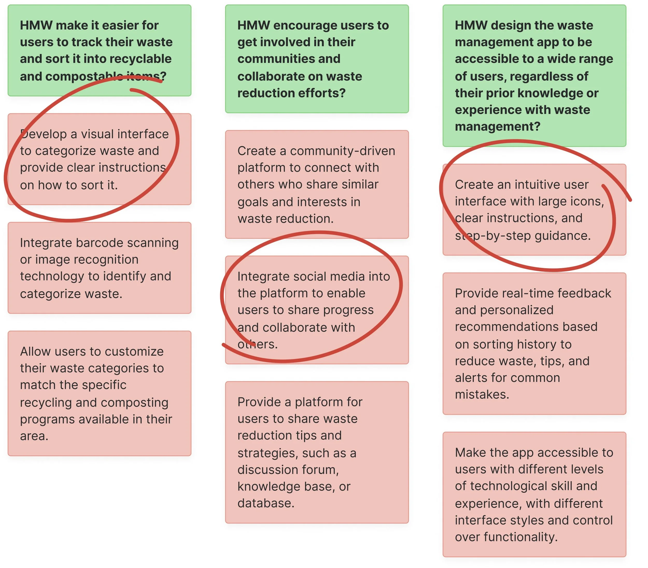
Ideate: How Might We?:
My research led to creating HMW statements. With only a short amount of time left, I asked my sister to brainstorm with me a few ideas for the app. I set a timer for an ideation session, we discussed each idea and then voted on the best possible ideas for the app to be successful and user-friendly. We collectively chose the best idea from each HMW statement.
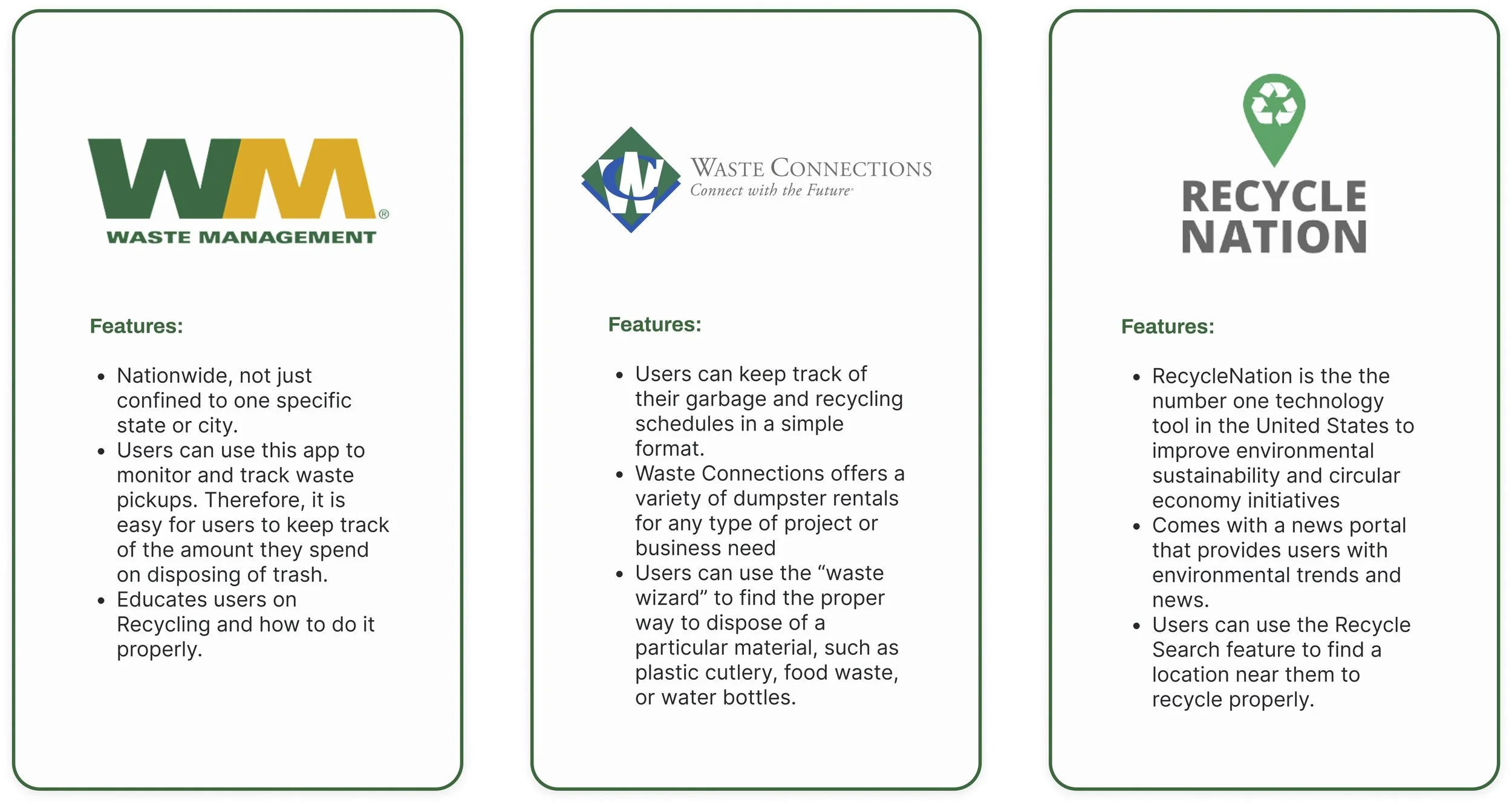
Competitive Analysis:
I knew there were similar apps on the market so, I conducted a competitive analysis of 3 existing applications to identify unique features that users may enjoy. They focused on the user interface, navigation, and ease of use of the apps, as well as the number and variety of features offered, and user feedback.

User Task Flow:
I developed a user flow to help design and optimize the app. I took into account the information from my user persona when I was deciding on the tasks for my user to complete. I had enough time to come up with 2 tasks: logging in/joining the app and scheduling a waste pick-up.
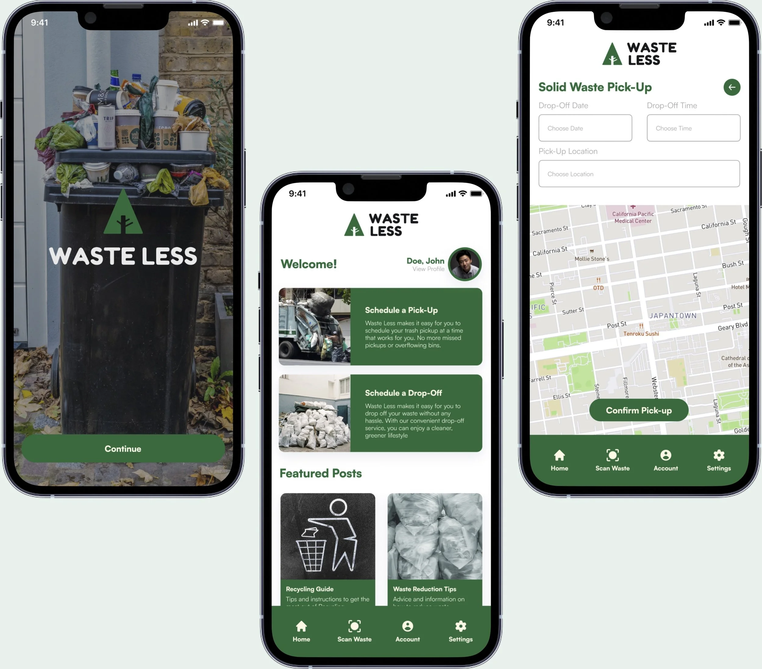
Sketches / Digital Lo-Fi Wireframes:
After deciding on the tasks for my users to complete, I was able to begin designing the base for my screens, knowing what tasks needed to be completed beforehand was a huge help in this process. It was easier for me to experiment with different ideas and make changes without incurring significant costs before beginning my digital low-fi wireframes. My focus was on defining the functionality of the app, rather than its appearance so early in the design process.


Style Guide:
With my user flow and screens sketched and mapped out, I moved onto the design system stage and created a style guide for Waste Less. I was already provided a logo in color so I had somewhere to start for the design system, but I had to make sure I maintained consistency and coherence within the design. I used Cadmium Green and Saffron Yellow as the primary colors, to represent sustainability and creativity.


User Testing:
With research, development, and design completed the next step was to conduct usability testing to see if the app would actually work in the real world with actual users. I focused on the task flows I previously created since I only had a set amount of time to complete this project. Some main points I focused on during the user testing were ease of use, functionality, design and aesthetics, and accessibility; creating a difficulty scale for those areas. Below are a few insights from the usability testing results.

Takeaways From Project:
Designing the Waste Less app required a deep understanding of user needs, requirements, and behaviors. The process included defining user personas, creating user task flows, sketches, and wireframes, designing a style guide and conducting usability tests to gather feedback from users. The goal was to create a user-centered experience that makes it easy for users to educate themselves on proper waste management and manage their waste effectively and efficiently. Although I only had a short amount of time I was still able to incorporate feedback from users and create an app to meet the needs of its users and promote sustainability and responsible waste management practices.